
How to Build a Cohesive Social Media Brand That Actually Looks Aligned
Why Cohesion Matters More Than Ever
In a world of shrinking attention spans, your brand has less than 50 milliseconds to make a visual impression. That’s all it takes for users to decide whether you’re credible, premium, or forgettable.
Here’s the reality — your brand extends far beyond your logo or color palette. It’s every pixel you share with the world. From your Instagram grid to your LinkedIn posts, from stories to carousel thumbnails — each visual touchpoint shapes how people feel about your brand.
What happens when those visuals lack consistency?
- You lose trust.
- You confuse potential clients.
- You miss conversions — even with a great product.
A cohesive brand presence, however, creates an immediate sense of clarity and confidence. It demonstrates your attention to detail. In today’s saturated digital landscape, these details distinguish memorable brands from forgettable ones.
What "Cohesive Social Media Branding" Actually Means

Cohesive social media branding isn’t just about looking pretty—it’s about building recognition, trust, and clarity across every digital touchpoint.
At its core, a cohesive brand feels the same wherever your audience encounters it. Whether someone lands on your Instagram reel, LinkedIn post, or Pinterest pin, they should instantly recognize it’s you—not just because of a logo, but through the overall look, tone, and energy.
Here’s what that actually involves:
1. Visual Consistency
This means aligning your color palette, typography, templates, and imagery. From Instagram highlight covers to LinkedIn carousel headers, everything should echo your visual identity—not look like a patchwork of styles.
2. Verbal Cohesion
Your messaging, captions, CTAs, and bios should speak in one unified brand voice. Are you playful or authoritative? Witty or minimal? Your tone should remain consistent across all platforms and post types.
3. Structural Alignment
Even the structure and layout of your posts matter. Consider your grid style, caption length, storytelling order in carousels, and how you present value in each format. Structure is branding too.
4. A Unified Brand Narrative
Every post contributes to your brand story—who you are, what you do, why it matters. A cohesive brand doesn’t just look the part, it feels aligned in its purpose across platforms like Instagram, LinkedIn, X, Pinterest, or YouTube.
When all these elements work together, your audience begins to feel your brand—and that emotional connection makes people stop scrolling, remember you, and take action.
7 Steps to Build a Cohesive Social Media Brand

Whether you’re building from scratch or refining your presence, these seven practical steps will help you create a brand that looks aligned, feels intentional, and performs across platforms.
1. Define Your Brand Core
Before any visuals or templates, you need clarity at the core of your brand:
- What's your purpose?
- What do you stand for?
- Who exactly are you speaking to?
Your brand vision, values, and audience should guide every visual and verbal decision. Without this foundation, your social presence will feel generic or scattered.
Example: A playful Gen Z streetwear brand might use bold colors, slang, and meme culture. A minimalist luxury skincare brand would lean into muted tones, refined typography, and calm, editorial language. Both are cohesive — just in very different ways.
2. Lock In Your Visual Identity
Your social media isn’t the place to experiment wildly with style. You need a clear, consistent visual identity that includes:
- A fixed color palette
- Specific typefaces (or font pairings)
- Rules for logo usage and iconography
- Defined grid style or post structure
This creates immediate recognition and emotional association — whether someone sees your story highlight or a LinkedIn thumbnail.
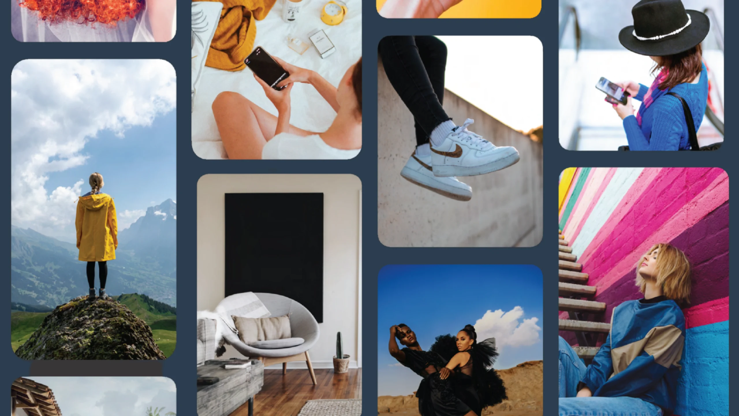
Pro tip: Compare two Instagram grids — one that uses consistent color, spacing, and tone versus one with random fonts, filters, and layouts. You’ll instantly feel the difference.
3. Build a Social Media Style Guide
A style guide is your alignment manual. It ensures every team member — from your designer to your VA — knows how to stay on-brand.
Include:
- Do's and don'ts for layouts and visual elements
- Caption writing tone (e.g., witty, formal, sarcastic)
- Emoji usage rules and CTA language
- Brand vocabulary (terms you always use versus avoid)
This small upfront investment saves hours of guesswork later — and keeps your audience’s trust intact.

4. Use Templates, Not Repetition
Templates are your secret weapon for visual consistency at scale. Use Canva or Figma to create modular templates for:
- Carousels
- Stories
- Testimonials
- Product posts
- Reels covers
But remember — templates should guide, not restrict. Too much repetition feels robotic. The goal is to keep structure while leaving room for brand personality.
Example: Brands like Mailchimp and Glossier use templates masterfully — you can recognize their posts instantly without them feeling stale.
5. Keep Messaging Aligned With Design
Your visual and verbal languages need to speak the same dialect.
If you look premium but write like a meme page — that’s a disconnect. If your design feels soft and nurturing but your tone is bold and direct — it creates confusion.
The goal: build a harmonious brand personality. One that feels the same in every scroll.
6. Audit Every Platform You're On
Take time to audit your presence across all platforms:
- Does your Instagram match your LinkedIn tone?
- Are your banners, bios, and cover images aligned?
- Are your highlights and icons visually consistent?
Tip: Don’t try to nail five platforms at once. Start with 1–2 channels your audience lives on, and expand once you have strong brand equity there.
7. Build Systems for Scaling Content
Cohesion breaks down when content is created on the fly. Instead, build systems that allow you to scale without losing structure:
- A monthly content calendar
- A shared asset library for visuals and templates
- Clear workflows for collaborating with designers, writers, or strategists
Use tools like Notion for planning, Figma for design assets, and Buffer or Later for scheduling. Your brand doesn’t just need to be cohesive — it needs to be sustainable.e.
Common Mistakes to Avoid

❌ Reposting Without Design Adaptation
Simply copy-pasting content across platforms without adjusting visuals or formats quickly dilutes your brand. Each platform has unique best practices — what works on Instagram often feels out of place on LinkedIn.
📌 Fix it: Adapt layouts, aspect ratios, and captions for each platform while maintaining your visual brand. Use platform-specific templates rather than clones.
❌ Overdoing Trends and Losing Brand Uniqueness
While trends can be valuable, chasing every new font style, meme format, or viral color scheme risks making your brand feel generic and inconsistent.
📌 Fix it: Select trends that align with your brand voice and values, not just what’s trending. Remember: consistency outlasts virality.
❌ Lack of Ownership or Visual Structure
Without a clear system for visual decisions, your feed becomes chaotic — especially with multiple contributors. This results in mismatched designs, inconsistent tones, and confused audiences.
📌 Fix it: Establish your structure through clear visual systems: consistent grids, recurring formats, branded covers, and unified tone of voice.
Final Thought
Your social media brand transcends mere content — it’s about curation. Avoiding these common pitfalls ensures your brand remains intentional, confident, and trustworthy.
Real-World Examples: Brands That Nail Cohesive Social Media Branding

Theory is one thing; execution is another. Let’s examine three brands that masterfully maintain visual and tonal alignment across social media, plus what happens when cohesion breaks down.
1. Notion
Why it works:
- Notion employs a minimalist visual identity that mirrors its product — clean, modular, and focused.
- Their fonts, colors, illustrations, and tone remain consistent across Instagram, LinkedIn, YouTube, and documentation.
- Their muted palettes, simple icons, and helpful language create instant familiarity across all platforms.
Takeaway:
They’ve created a brand that feels like the product itself — simple, useful, and calming. This alignment cultivates lasting trust.
2. Glossier
Why it works:
- Glossier's millennial pink, minimal fonts, and soft photography have become their signature.
- Beyond product posts, they weave lifestyle content, customer reviews, and community stories into their visual narrative.
- Their tone of voice — casual, authentic, and relatable — perfectly complements their clean, effortless design.
Takeaway:
Glossier’s feed achieves emotional cohesion, with every post, caption, and story radiating the same energy.
3. Mailchimp
Why it works:
- Mailchimp's distinctive use of illustrations, bright yellow, and playful type creates instant recognition.
- Even as they explore various formats (reels, infographics, memes), they maintain their core brand structure.
- Their voice — quirky, confident, and helpful — perfectly matches their visual expression.
Takeaway:
They’ve mastered the balance between creativity and consistency — the sweet spot for scalable branding.
❌ Where It Falls Apart: Inconsistent Brands
We won’t name names, but we’ve all encountered brands that:
- Place over-designed carousels alongside low-quality screenshots
- Switch between formal and casual tones without purpose
- Deploy five different color schemes in a single week
The result?
Zero trust, zero memorability, zero reason to follow.
What You Can Learn
Cohesive social branding isn’t about identical posts — it’s about feeling aligned. The best brands don’t simply duplicate content; they curate it. They understand their identity and express it confidently in every post.
Bonus: When to Bring in a Designer or Strategist

Sometimes, adjusting templates and refining captions can’t address the core issue — a broken brand system. If your social presence feels disjointed, inconsistent, or unrecognizable between posts, professional help might be necessary.
⚠️ Signs Your Brand Needs Outside Help:
- Your visuals feel scattered, lacking clear structure
- Your team spends excessive time debating how posts should look
- You're attracting the wrong audience or seeing low engagement
- Your social platforms misalign with your brand's current positioning
- You've outgrown basic design tools and need scalable, strategic systems
🎨 What a Visual Identity Revamp Actually Delivers:
- A comprehensive codified design system tailored to your audience and platforms
- A robust brand tone and messaging framework
- Templates and workflows for faster, smarter content scaling
- A cohesive presence that conveys premium quality, intention, and trustworthiness
This isn’t mere cosmetic enhancement — it’s brand infrastructure that transforms attention into trust, and trust into business.
Final Thoughts

Cohesive social media branding means making every post authentically feel like you.
True cohesion creates clarity, not uniformity. It enables your audience to instantly recognize your brand, understand your values, and trust you — before they even follow or visit your site.
Consistent cross-platform presence builds more than content — it creates familiarity and credibility.
In today’s noisy digital landscape, victory belongs not to the loudest brands but to those that appear intentionally, visually aligned, and strategically consistent.
If your social media feels fragmented, messy, or misaligned with your brand’s direction — consider rebuilding the system behind your content.
Because ultimately, your social media isn’t just a feed —
It’s your brand’s most visible billboard. Make every post count.
Ready to Align Your Brand for Growth?
We’ll analyze your current platforms, identify cohesion gaps, and recommend high-impact improvements to elevate your brand presence.


