


Skincare & Beauty Branding: What Makes a Product Look Premium on the Shelf

The Shelf is the Battlefield
In the skincare and beauty industry, your product doesn’t just compete on quality — it competes on perception.
Before a customer ever reads the ingredients, feels the texture, or tests the scent, they judge your product based on how it looks. And whether it’s a physical retail shelf or a grid of online product thumbnails, that first visual impression is everything.
This is where premium skincare branding earns its place.
- A product that looks elevated instantly builds trust
- A refined visual identity suggests thoughtful formulation
- Cohesive packaging communicates consistency, care, and confidence
On the shelf, your brand has seconds to spark curiosity. If the design feels off — too busy, too cheap, too generic — the product doesn’t even get picked up. But if it looks clean, intentional, and high-end, it speaks before the label does.
In beauty, visual design isn’t decoration.
It’s persuasion.
What Makes a Beauty Product Look Premium?
Looking premium isn’t about adding gold foil or copying the latest trending aesthetic. It’s about designing with intention, restraint, and clarity. Premium skincare branding focuses on visual and material cues that quietly communicate quality, trust, and value — without shouting for attention.
Here are five core elements that consistently signal a high-end beauty product:
1. Simplicity in Design
Premium brands don’t over-explain or over-design. They keep layouts clean, messaging minimal, and visuals balanced. This clarity shows confidence — a brand that doesn’t need to convince, just present.
- Use negative space generously
- Avoid clutter or excessive graphic elements
- Focus on a single hierarchy of information: product name, benefit, and identity
A quiet layout often speaks louder than a loud one.
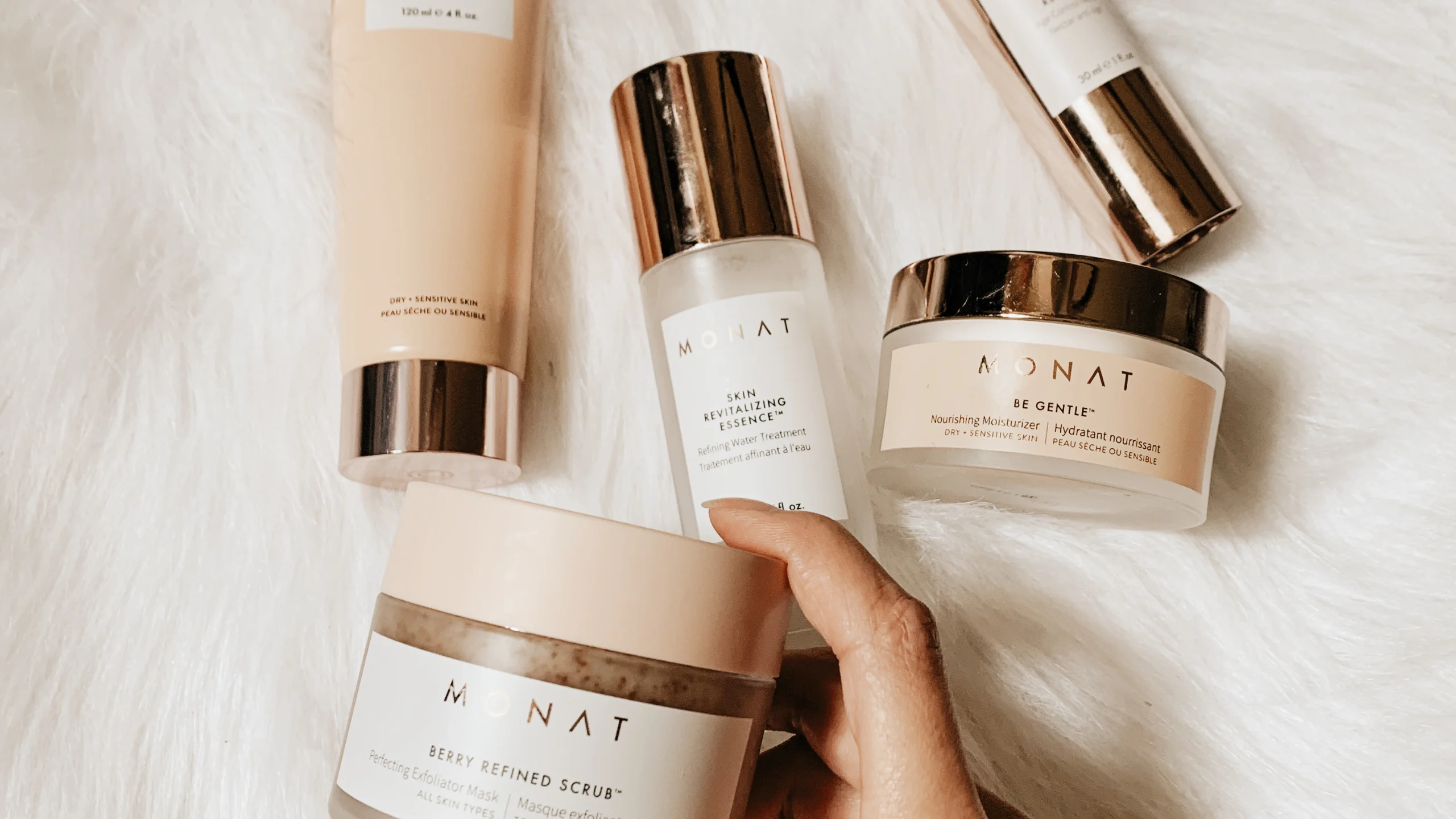
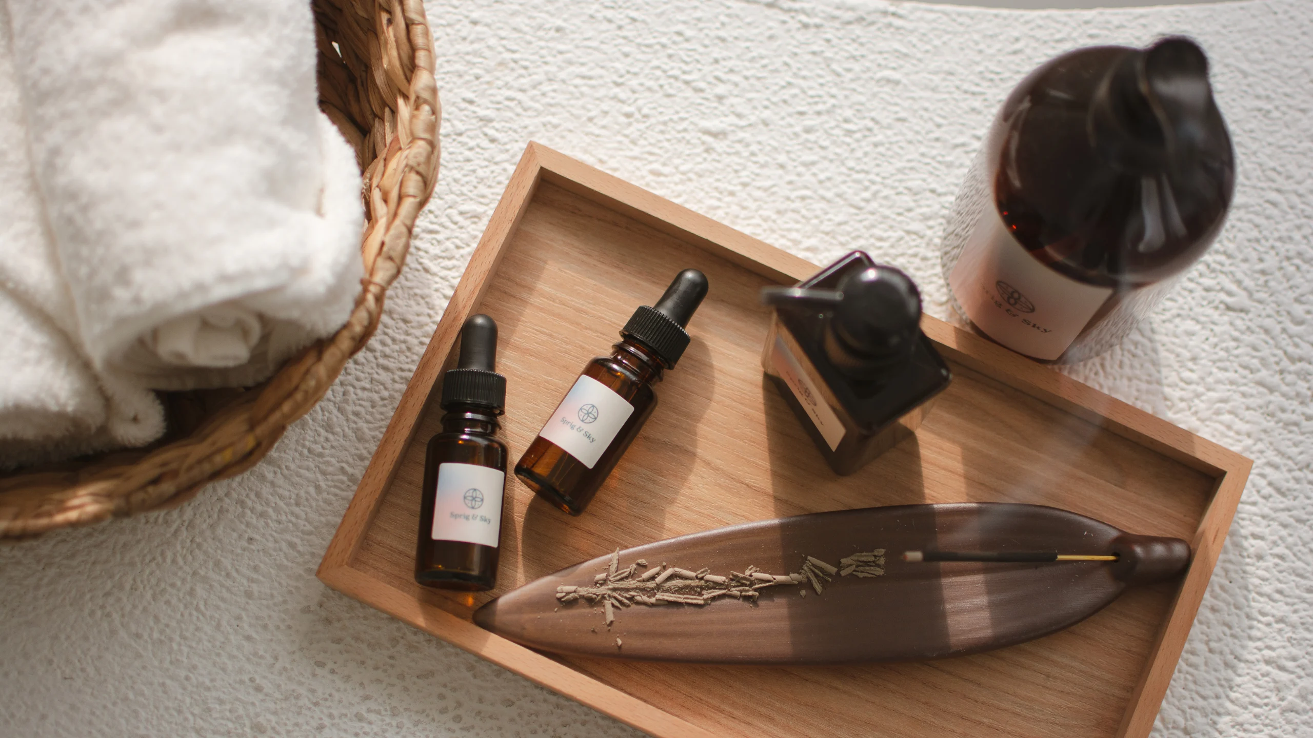
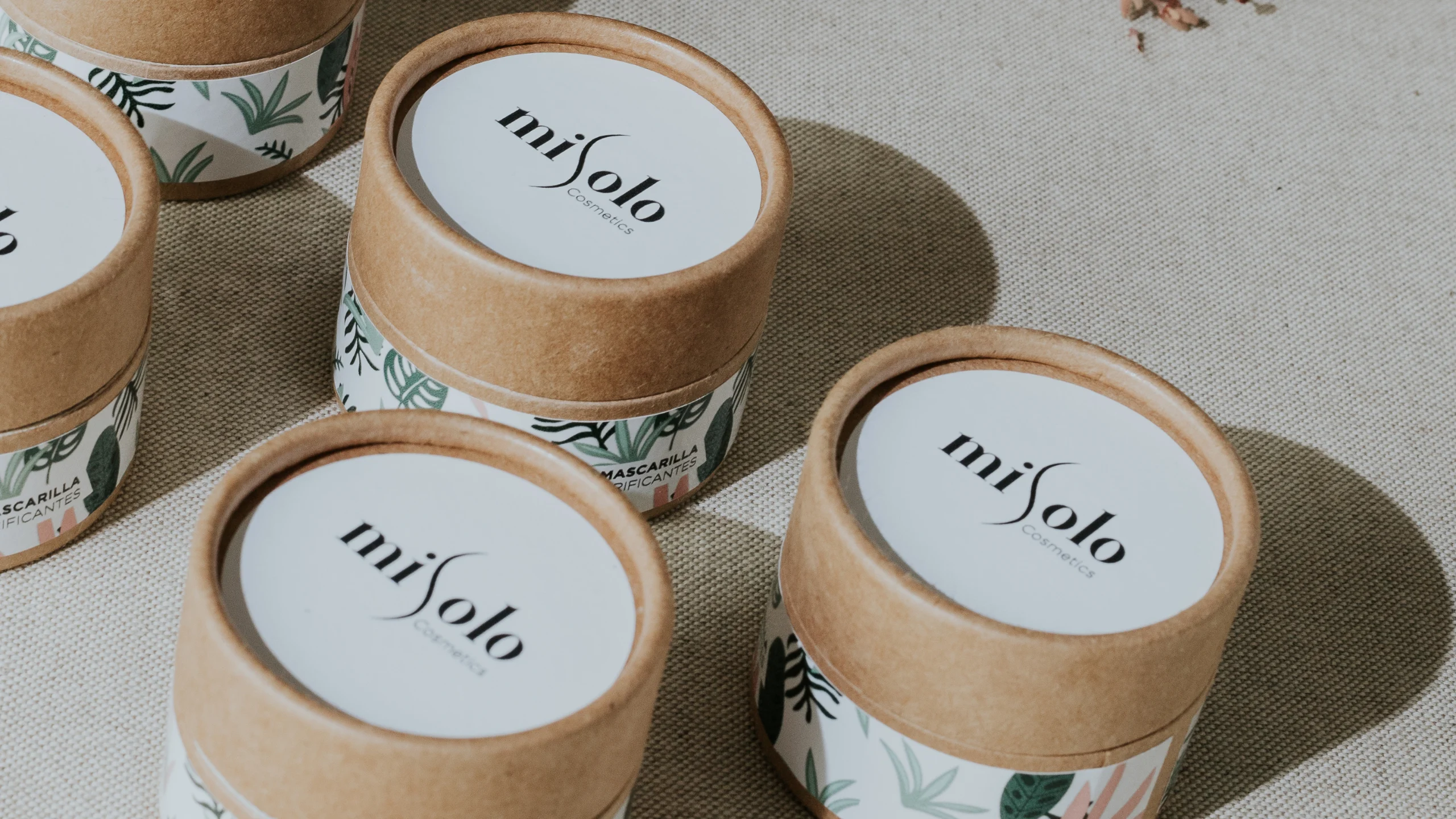
2. High-Quality Materials and Finishes
The way a product feels in the hand says as much as how it looks.
- Choose materials with tactile impact: matte coatings, velvet-touch boxes, or frosted glass
- Use finishing techniques like embossing, foil stamping, or textured paper
- Even sustainable materials can feel premium when paired with thoughtful design
Well-executed materials elevate the entire unboxing and usage experience, turning packaging into a moment of luxury.
3. Elegant Typography
Typography sets the tone. The fonts you choose can make a product feel clinical, natural, artistic, or indulgent.
- Use carefully spaced serif or minimalist sans-serif fonts
- Avoid decorative type or overcrowded layouts
- Maintain consistent type hierarchy across SKUs and formats
When typography is thoughtful and unobtrusive, it creates a sense of order and elegance.
4. Distinct Color Strategy
Premium brands often lean into restraint when it comes to color.
- Muted tones, soft neutrals, monochrome palettes — all create a sense of calm and quality
- Avoid clashing colors or hyper-saturated hues unless part of a larger strategy
- Think about color psychology: green for nature, blue for trust, white for purity
Your palette should feel like an extension of your product philosophy.
5. Unified Visual Identity
The most premium-looking products don’t just look good on their own — they fit seamlessly into a brand ecosystem.
- Packaging, website, Instagram, and product inserts should all feel visually connected
- Founder story, tone of voice, and product values should align with the design
- A strong identity system makes your product instantly recognizable and harder to imitate
Premium isn’t just about how the box looks; it’s about how the brand behaves across every channel.
Examples of Premium Skincare Branding That Works
Premium skincare brands don’t just rely on good design. They use branding to shape perception, build trust, and reinforce their product philosophy. Below are three standout examples that show how strategy, identity, and storytelling come together to create products that look and feel elevated.
Aesop
What works:
- A minimalist design system rooted in apothecary heritage
- Muted colors, structured typography, and amber bottles create visual consistency
- The brand voice is thoughtful, intellectual, and slow-paced — matching its visual tone
Why it feels premium:
Aesop’s design reflects a sense of ritual and sophistication. It doesn’t try to sell luxury through excess. Instead, it builds quiet authority through simplicity and calm.
Forest Essentials (India)
What works:
- A blend of modern luxury and traditional Ayurvedic aesthetics
- Use of rich colors, gold accents, and script-style typography
- Heritage-inspired packaging that feels opulent yet rooted in Indian wellness philosophy
Why it feels premium:
Forest Essentials aligns its visual identity with the brand’s core value — ancient beauty rituals in a modern form. Every touchpoint feels indulgent, intentional, and culturally authentic.
Drunk Elephant
What works:
- Clinical, science-first packaging offset by playful pops of color
- Bold sans-serif typography and high-contrast layouts
- A strong, outspoken brand voice that stands out in a crowded market
Why it feels premium:
The packaging looks professional but not sterile. It speaks to clean beauty without being boring — creating a distinct personality that appeals to both skincare enthusiasts and casual buyers.
These brands don’t just look premium. They use branding as a complete experience from product and packaging to language and lifestyle. That’s what builds trust and long-term loyalty.
Mistakes That Cheapen a Skincare Brand
While it’s tempting to focus on trends or bold visuals to stand out, the wrong choices can quickly make a skincare product feel cheap, crowded, or confusing. A brand that aims to be premium must avoid these common mistakes that dilute perceived value.

❌ Overuse of Shine, Gradients, or Busy Design
Shiny surfaces, complex gradients, and overly decorated packaging often signal lower quality in the premium skincare space. These styles can feel dated or mass-produced, especially in clean beauty categories.
Fix: Keep the finish matte, the layout clean, and the visual language minimal. Let the product speak for itself.
❌ Inconsistent Packaging Across SKUs
When each product in a line looks like it belongs to a different brand, it creates confusion. Customers lose trust when they can’t recognize your product instantly across a shelf or website.
Fix: Create a flexible identity system that allows for variation in color or iconography while maintaining structure across your range.
❌ Mismatch Between Visual Identity and Product Promise
If your brand voice is gentle and rooted in natural ingredients, but your design feels clinical or flashy, there’s a disconnect. Customers may feel confused about what you really stand for.
Fix: Align your design with your core values. Use color, materials, and tone that reflect your formulation philosophy and audience expectations.
❌ Poor Typography or Print Quality
No matter how good your product is, a label that’s hard to read, crowded, or poorly printed cheapens the experience. Customers associate design precision with product quality.
Fix: Invest in clear typography, high-resolution printing, and paper or material finishes that reflect your price point.
Premium branding is about restraint, clarity, and consistency. The moment it feels cluttered or off-brand, the perceived value begins to drop.
When to Invest in Brand Identity and Packaging Design
If you’re launching or growing a skincare brand, design isn’t just a finishing touch — it’s a business tool. Investing in strong brand identity and packaging early on can influence how customers perceive your product, how much they trust it, and how often they return.
Here are the key moments when investing in branding becomes essential:
✅ You're Launching a New Product or Line
First impressions are lasting. A well-defined brand identity and premium packaging will help your product stand out immediately, whether on a physical shelf or online marketplace. This is especially important if you’re entering a competitive category or targeting a discerning audience.
✅ You’re Targeting a Premium Price Point
If your product is priced above market average, your branding must visually justify it. Customers judge value based on what they see first. Clean layouts, quality finishes, and a confident identity give your brand the authority to charge more — and retain loyalty.
✅ You’re Entering Retail or High-End Marketplaces
Retail shelves are unforgiving. You’ll be placed next to brands with strong design systems and years of market recognition. To compete, your packaging needs to attract attention without gimmicks — and hold up in both physical display and digital thumbnail views.
✅ You’re Struggling With Recognition or Copycats
If customers confuse your brand with others or your visuals feel forgettable, it may be time for a visual reset. A strong identity system helps protect your brand, create recall, and reinforce your uniqueness in a crowded space.
Final Thoughts

In skincare, your product is judged long before it’s tried. Customers scan the shelf or scroll past a product image and instantly decide if it feels credible, clean, or worth their time.
That decision isn’t based on ingredients or reviews — it’s based on what they see.
A premium-looking skincare brand doesn’t happen by accident. It’s the result of intentional design choices, a clear story, and a commitment to consistency across every touchpoint.
From the packaging to the typography, from the brand voice to the color palette, every element must work together to say one thing with confidence:
You can trust this.
If your brand visuals are unclear, inconsistent, or simply forgettable, you’re not just losing aesthetic points — you’re losing sales, loyalty, and shelf space.
Want to build a skincare brand that looks as good as it works?
Let’s turn your product into something customers can’t ignore.
Book your free discovery call with The Schedio


