


What Is a Visual Identity System? (With Real Examples & Use Cases)
In a crowded and competitive digital landscape, where brands are constantly vying for consumer attention across websites, social media platforms, ads, packaging, and storefronts, visual consistency has become a key differentiator. A visual identity system is far more than just a logo or a few nice colors. It is a well-orchestrated, comprehensive, and strategic design framework that allows a brand to be instantly recognized — and remembered — wherever it shows up.
This extended guide will walk you through everything you need to know about visual identity systems: what they are, why they matter in today’s marketplace, how to build one that scales, and real-world examples that demonstrate their power in action.
What Is a Visual Identity System?
A visual identity system is a collection of consistent design components — and a rulebook for using them — that together create a unified visual representation of a brand across all touchpoints. It defines not just how a brand looks, but how it behaves visually.
It includes essential design elements such as:
- Primary and secondary logos
- Brand color palettes
- Typography systems
- Photography and illustration styles
- Layout grids and spacing rules
- Iconography and graphic motifs
- Motion behavior and digital transitions
More than just a static style guide, a visual identity system serves as a dynamic toolkit that evolves with the brand. It governs how these design elements are applied across every piece of communication — from websites and social media to physical packaging and event booths.
A strong system ensures that every visual expression of your brand feels cohesive and unmistakably yours. Where a logo helps people identify you, a visual identity system helps them remember you.
Why a Visual Identity System Matters

If you want your brand to build trust, recognition, and impact — especially as it grows — having a consistent and flexible visual identity system is non-negotiable.
Here’s why:
- It reinforces brand recognition: Repetition builds memory. When customers see the same colors, type, and structure across your assets, your brand sticks.
- It builds trust through professionalism: Inconsistent design looks careless. A well-structured system sends the message that you are thoughtful, organized, and high-quality.
- It enables scale without chaos: As your team, platforms, and content output grow, a system allows others to create without diluting the brand.
- It makes decision-making faster: With templates and rules in place, designers and marketers can focus on strategy, not reinventing layouts or colors.
- It improves usability: Especially in digital interfaces, a consistent visual language helps users navigate more intuitively.
Core Components of a Visual Identity System
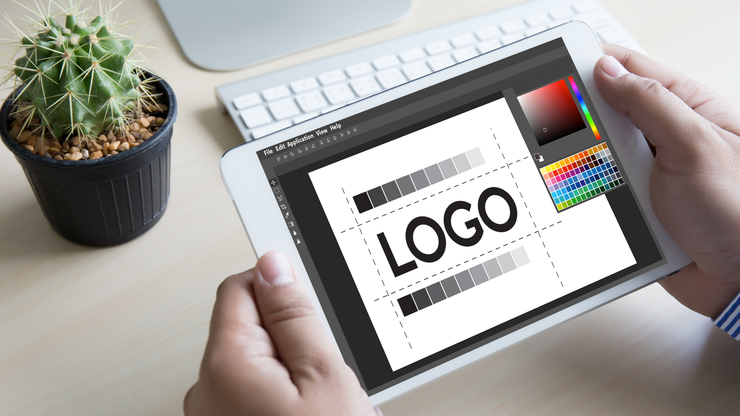
1. Logo Suite
Your primary logo, horizontal or vertical variants, icon-only versions, wordmarks, and lockups for specific uses. Also include spacing rules, minimum sizes, and usage restrictions.
2. Color Palette
Your brand’s primary and secondary colors with HEX, RGB, and CMYK codes. Include how and where to use them, contrast ratios for accessibility, and guidance on combining them effectively.
3. Typography System
Header and body fonts with clear hierarchy, style usage (e.g., bold for CTAs), tracking and leading values, and alternatives for web-safe or fallback fonts.
4. Imagery Style
Define how photography should look: lighting, subject matter, saturation levels, cropping styles, and emotional tone. Also cover illustration types — flat, 3D, line, or collage — and editing treatments.
5. Layout Principles
Set grid systems, margins, spacing ratios, and how to handle responsive design across devices. Layouts ensure that your designs feel visually balanced and consistent, even when made by different teams.
6. Iconography & Patterns
Establish icon styles (stroke thickness, corner radii), icon behavior on hover, and brand motifs or textures that can appear on backgrounds or packaging.
7. Motion & Digital Behavior
For digital-first brands, motion is part of the system. Include hover effects, scroll animations, video transitions, and interaction behavior on apps and websites.
8. Usage Guidelines
The system’s rulebook. Include do’s and don’ts, usage context, misuses to avoid, and real examples of correct application. Ensure the guide is accessible to both designers and non-designers.
Visual Identity System vs. Brand Identity

These two concepts are related but not interchangeable. Your brand identity is your entire strategic brand expression — including your mission, vision, values, personality, tone of voice, and design language.
Your visual identity system is the tangible design system that expresses the visual side of that identity.
Think of it like this:
- Brand identity = who you are, what you say, what you value
- Visual identity system = how that looks, moves, and feels visually in the world
They must be tightly aligned for your brand to feel consistent and credible.
How to Build a Scalable Visual Identity System

Step 1: Anchor It in Strategy
Don’t design in a vacuum. Begin by clearly defining your brand strategy — your audience, positioning, value proposition, and emotional goal. The visuals should bring this to life.
Step 2: Establish a Visual Foundation
Start with your logo, colors, and typography. These are your non-negotiables and the core of all future design. Make sure they reflect your strategy and scale across mediums.
Step 3: Expand to Key Brand Expressions
Extend your core identity into brand touchpoints like social templates, website UI, email headers, product packaging, pitch decks, and more. Keep testing for consistency.
Step 4: Build a System, Not Just Assets
Document rules for layout, spacing, responsiveness, image use, icon design, and motion. This is what transforms a collection of visuals into a usable, scalable system.
Step 5: Test and Evolve
A visual identity system is a living document. Test your elements in real use cases and update regularly. Ensure it evolves as your product line, team, or positioning shifts.
Real-World Examples of Visual Identity Systems
Apple
Apple’s design system is famously clean, modern, and minimalist. From hardware to interfaces, every element follows strict design logic. Their consistency in typography, iconography, and color (especially white and black space) makes them unmistakable.
Glossier
Glossier’s identity system combines clinical beauty with millennial friendliness. Their use of pinks, greys, custom sans-serif type, and high-contrast photography creates a brand that is both personal and professional.
Spotify
Spotify leverages duotone gradients, bold typefaces, custom illustrations, and fluid layout systems across devices. Their identity is loud, flexible, and expressive — perfect for a brand rooted in music and mood.
Airbnb
Airbnb’s rebrand introduced the Bélo symbol, a calming red palette, custom typeface, and a modular layout that extends to homes, guides, signage, and digital tools.
Forest Essentials (India)
This luxury Ayurvedic brand blends traditional Indian aesthetics with clean luxury design. Gold foils, heritage patterns, serif fonts, and balanced spacing give their system an elite yet grounded visual feel.
Use Cases Where Visual Identity Systems Shine
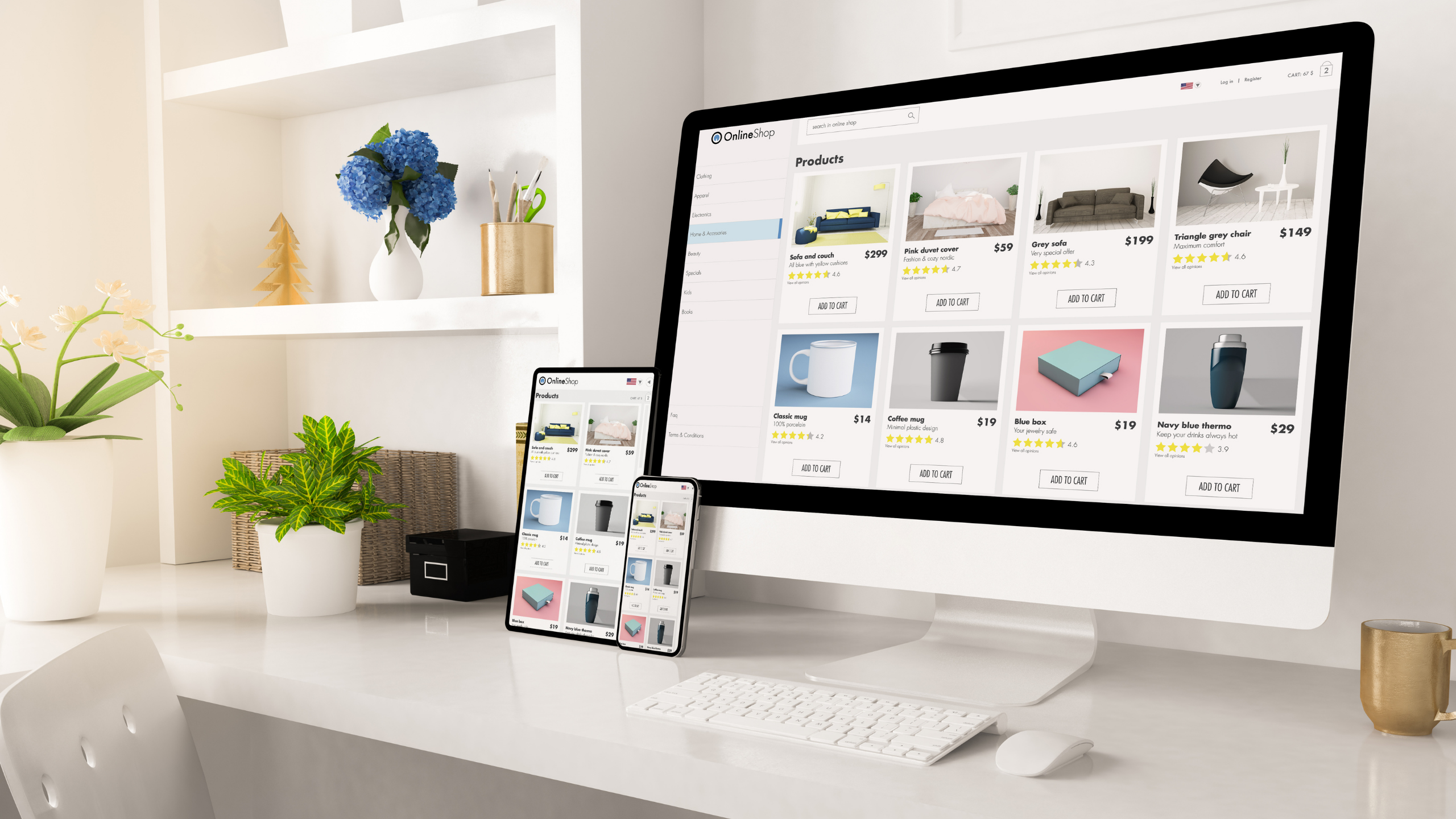
- Website and App UI: Buttons, spacing, banners, forms, and headers
- E-commerce Packaging: Unboxing inserts, tissue wrap, and outer boxes
- Retail Display: In-store signage, shelf tags, uniforms, and POS design
- Social Media Branding: Carousels, reels, profile pics, and covers
- Investor & Sales Collateral: Pitch decks, brochures, PDF templates
- Video Content & Motion Design: Lower thirds, intros, transitions
- Events & Conferences: Banners, booths, name badges, stage visuals
Final Thoughts

A visual identity system is one of the most powerful investments a brand can make. It turns fragmented design into a cohesive experience. It ensures that as you scale, you don’t lose clarity. It gives designers and marketers the tools they need to create confidently, consistently, and quickly.
In a world where design is the language of business, brands with well-built visual identity systems will lead.
Need help building yours? The Schedio helps startups and scaling brands build systems that last.
Book Your Visual Identity Strategy Call with The Schedio


)