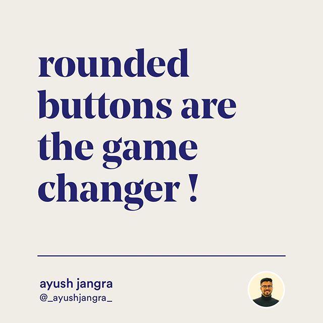
What kind of button do you prefer when you’re creating a button for your design? Do you prefer sharp corners in your button or do you prefer rounded corner buttons?
Ayush Jangra, founder and creative director of Bruvvv is here to help us with it. Here he tells us how rounded buttons are the game-changer. Why rounded corners are better when used right and when to use it.
Ayush’s words:
What if I tell you that, subconsciously, rounded corners have an effect on the human psyche? should we swap sharp-cornered buttons with rounded buttons? do rounded buttons perform better usability?
These are the questions you may run into when you dive into the UX behind rounded buttons in apps.
There is no right or wrong between applying a rounded look or a sharp-cornered appearance on buttons. A button’s corner radius should enable, encourage, and empower users to interact with the app, and reduce distractions by all means.
In essence, no tapping means no win.
1. Rounded Buttons Are The Game Changers


2. Rounded Corners Are More Effective Than Sharp Corners
It’s because of a smoother feel with very few edges or hard angles to be found. This “smoothness” not only speaks to usability but also fosters an emotional connection with the device.


3. Fascination With Rounded Corners
Take the iPad for instance. Apple put a lot of effort into creating a device that feels more like it grew on a tree than assembled in a factory.


4. Rounded Corners Are More Recognizable
It takes a less cognitive load to see rounded rectangles than it does to see sharp-cornered ones.
It’s because distinguishable edges on the corners of cards guides our eyes to recognize the visual differences. Conversely, cards with sharp corners look identical and unified from each other, which are less likely to attract our attention.


5. Pinterest vs Google Images


6. Oversaturating Your Design With Rounded Corners Isn’t A Good Idea
Fully rounded buttons are excellent in interfaces that have adequate space.


7. Full Rounded Buttons Can Cause Usability Issues


8. Create’s Emphasis
Because unique shapes stand out, they can direct attention to different parts of a screen.
This combination of a round floating action button and a curved bottom app bar stands out from the rectangular shapes elsewhere on the screen.


9. Rounded Corners Evoke Warmth & Trust
Many call them “friendly rectangles” for this reason. That is why many call-to-action buttons are designed this way. It makes customers feel safe about doing business with a brand.


Thank You


Did you find the post helpful? If so, check out more of Ayush’s tips on his Instagram page here. And share this post with someone who can benefit from it.
Let us know your thoughts in the comment box below. Thank you😊

