What comes to your mind when you hear a double meaning logo? Yes, this article is about that. Logos with double meaning. But in a good and sensible way. These double meaning logos serve the purpose they are designed for. And they are very good examples of what logo designers try to achieve.
If you wish to look at some bad examples of double meaning logos, I’d highly recommend you to check “Graphic Designer Redesigns 9 Worst Logos Ever”. These logos are hilarious and a very good example of what a logo designer must note when they’re designing their logos.
These logo designs are from various world-class logo designers. If you like their logos, do check them out and support them. So, without further ado, let’s check out these awesome double meaning logo designs.
Double Meaning Logos
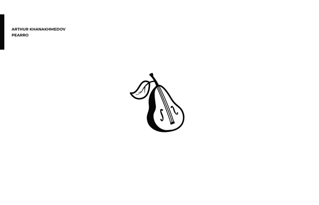
Arthur Khanakhmedov – Pearro
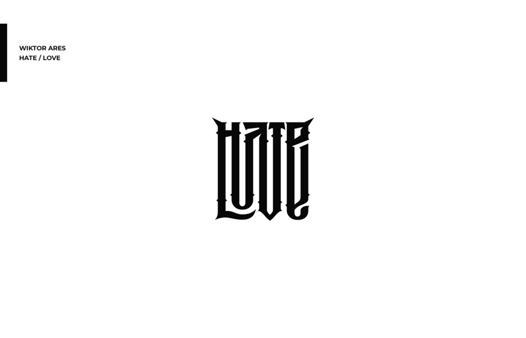
Wiktor Ares – Hate / Love
Alexandra Lekomtseva – Crimean Cosmetics

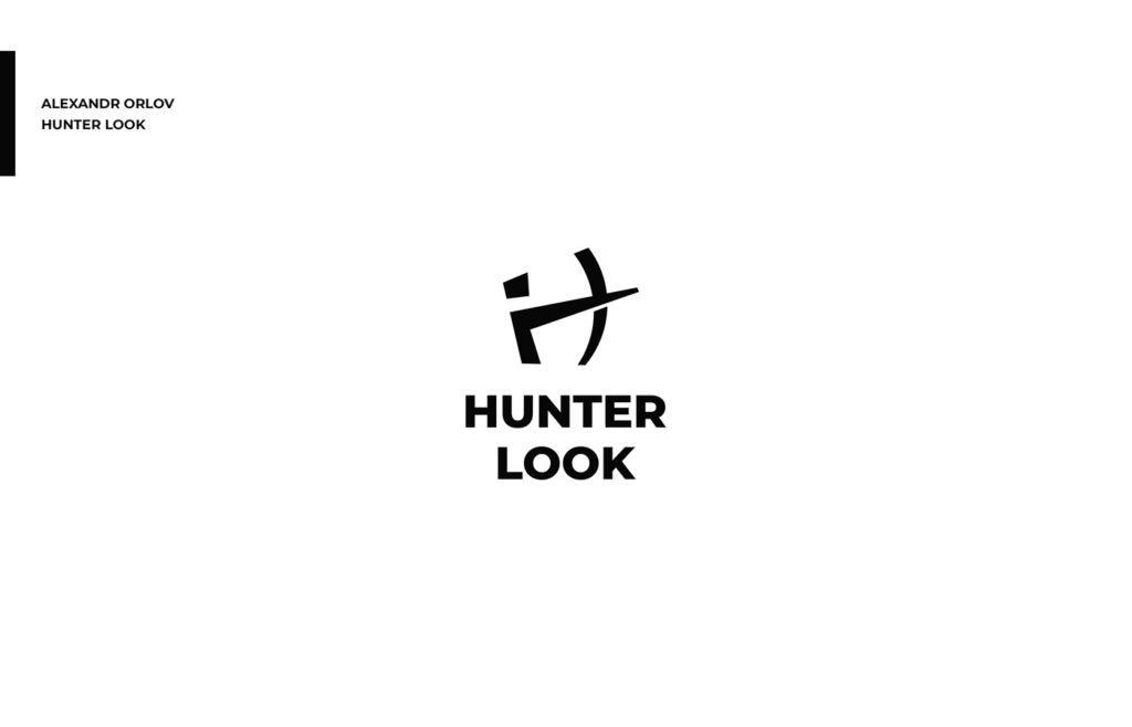
Alexandr Orlov – Hunter Look
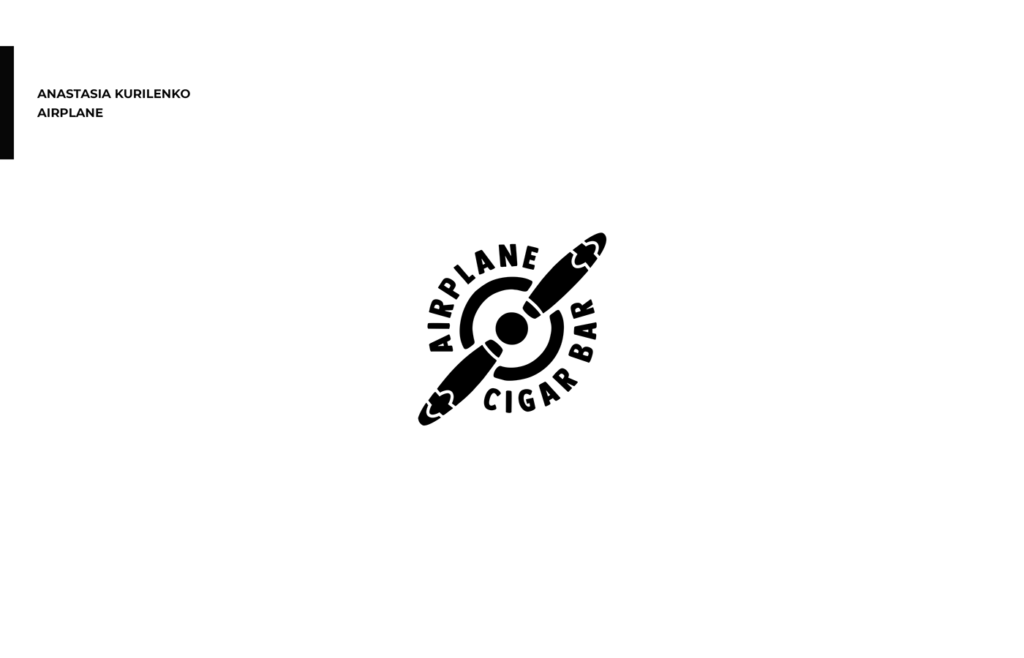
Anastasia Kurilenko – Airplane
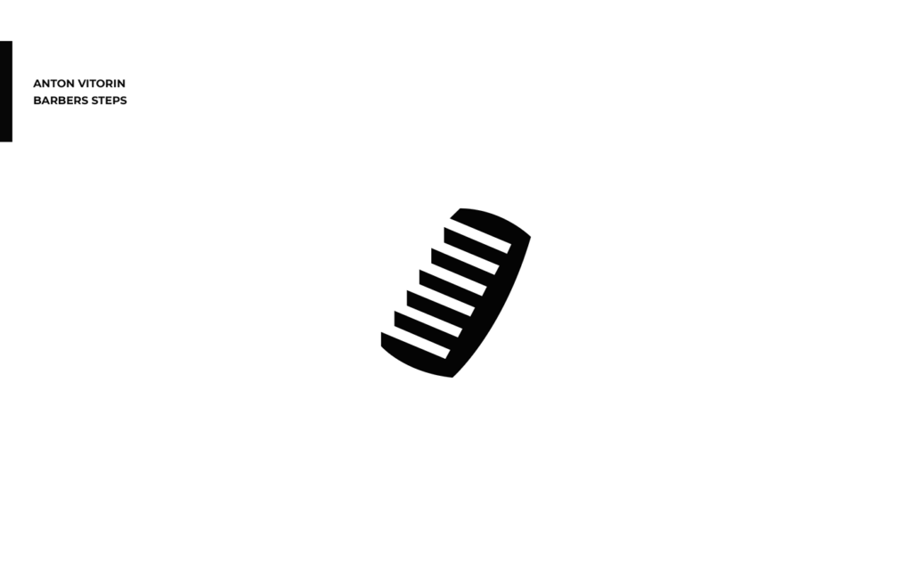
Anton Vitorin – Barbers Steps
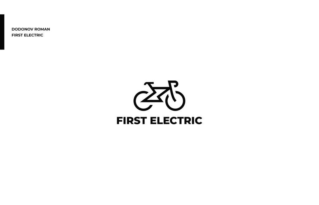
Dodonov Roman – First Electric
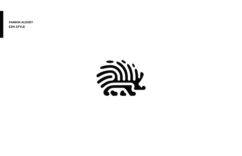
Fankin Alexey – Ezh Style
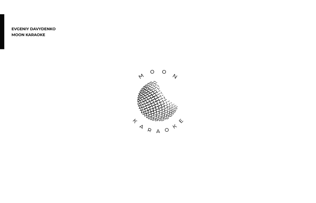
Evgeniy Davydenko – Moon Karaoke
Gaev Ilya – Rusalko
Ilya Stallone – Sparta
Look Studio – Tunnel Parallel
Kristina Mendigo – Flower Woman
Ksenia Vega – Leon
Larisa Iskritskaya – Food Spielberg

Makarov Oleg – Paper Magic
Mandrov Maxim – Milk
Mitya Vilson – Finch

Panov Denys – Recovery

Pentacle Ship – Yen

Philipp Ponomarev – Pride

Shamaev Sergey – Hahado
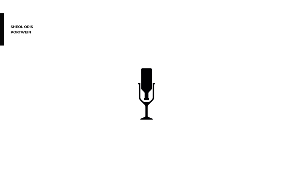
Sheol Oris – Portwein
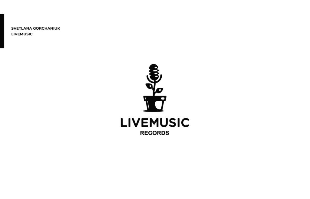
Svetlana Gorchaniuk – Livemusic
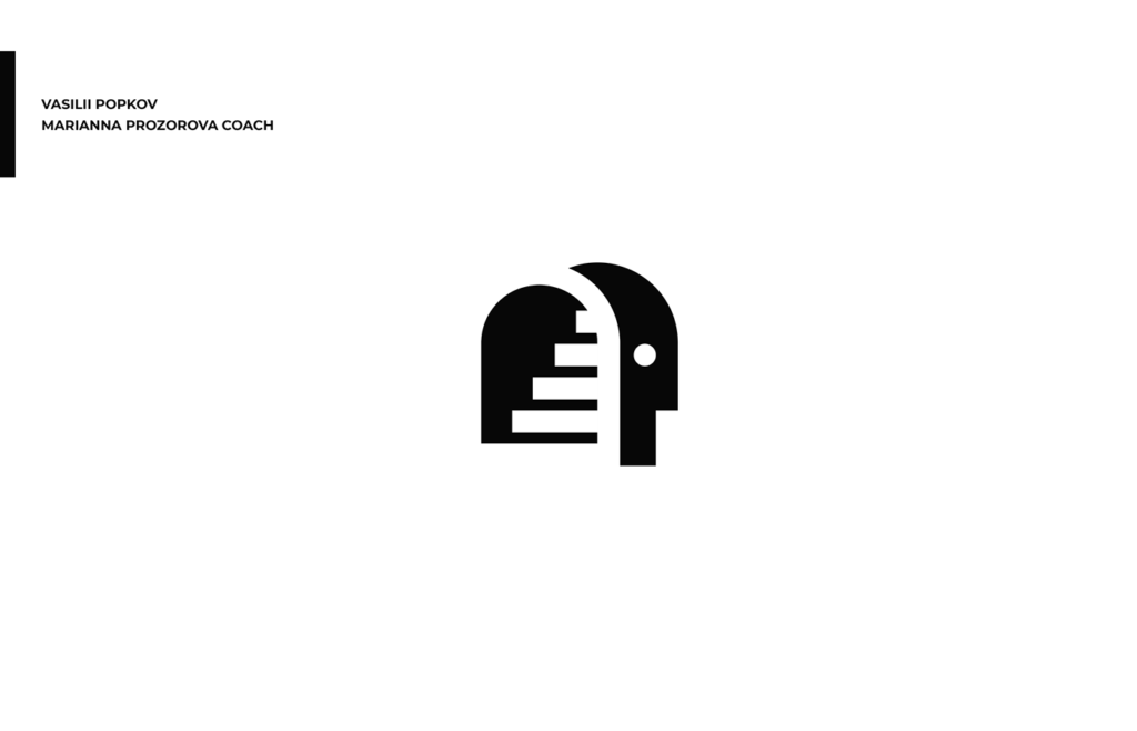
Vasilii Popkov – Marianna Prozorova Coach
Yakovenko Sergey – Battery

Did you enjoy the post and found something helpful and inspiring? If so, please share it with a friend who might like it as well. Thanks for visiting.

