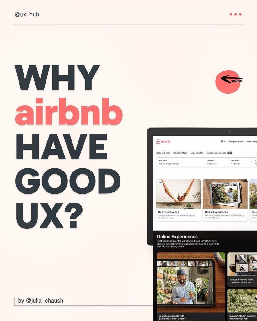
Among all its competitors, Airbnb stands out and that’s why it has built the reputation it has right now. Because of the service they provide, and the experience they give to their users, they’ve managed to build this multi-billion dollar company, or say brand to be much more precise. But, have you ever asked why Airbnb have good UX?
Today we’ll be having a look at why Airbnb have good UX through Julia Chaush’s informative post, who is a UX/UI designer and an online educator. So, without further ado, let’s have a look at how Airbnb provides a pleasing experience.
Why Airbnb Have Good UX?


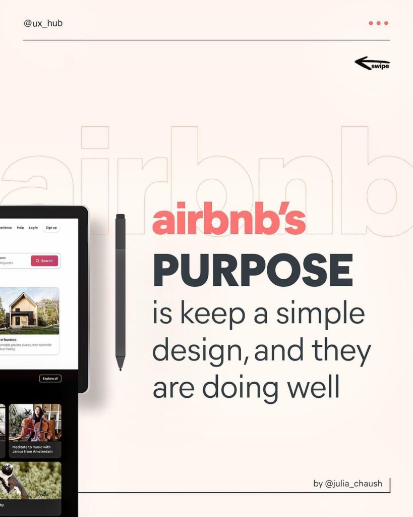
Airbnb’s purpose
Their purpose is to keep a simple design, and they are doing very well at it. How so? We’ll see in coming points.


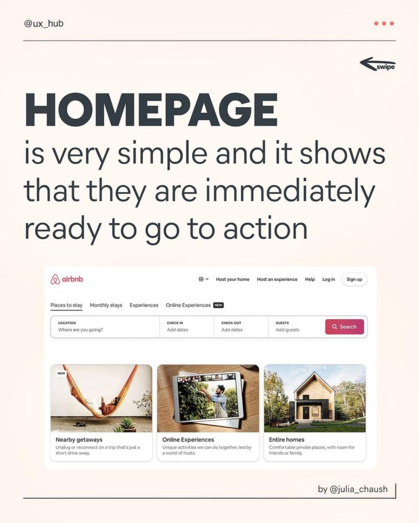
Homepage
The Airbnb’s homepage is very simple and it shows that you are immediately ready to go to action. Serving its purpose without confusing their users.


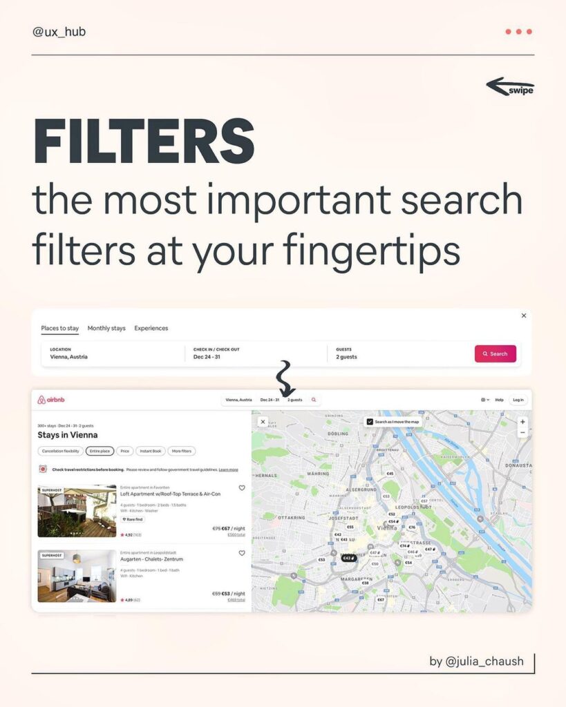
Filters
The most important search filters are at the user’s fingertips. Unlike many other platforms which complicates this process by adding a bunch of “not so useful” filters, Airbnb puts only the search filters that matters and their users might need.


Map
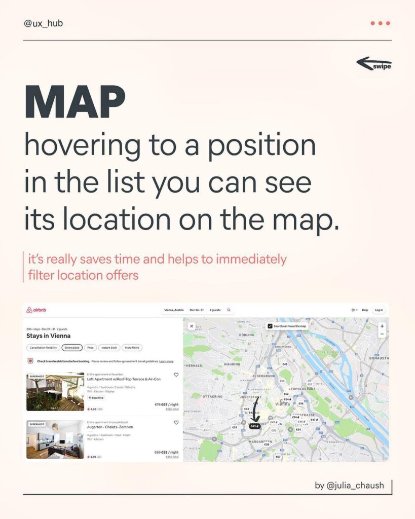
This is a very simple but effective feature that Airbnb gives. Hovering to a position in the list, and you can see its location on the map. It’s not like this feature is only available on Airbnb, but the sheer simplicity of this feature on their platform is what distinguishes it. It also saves a lot of time and helps to immediately filter location offers.


View
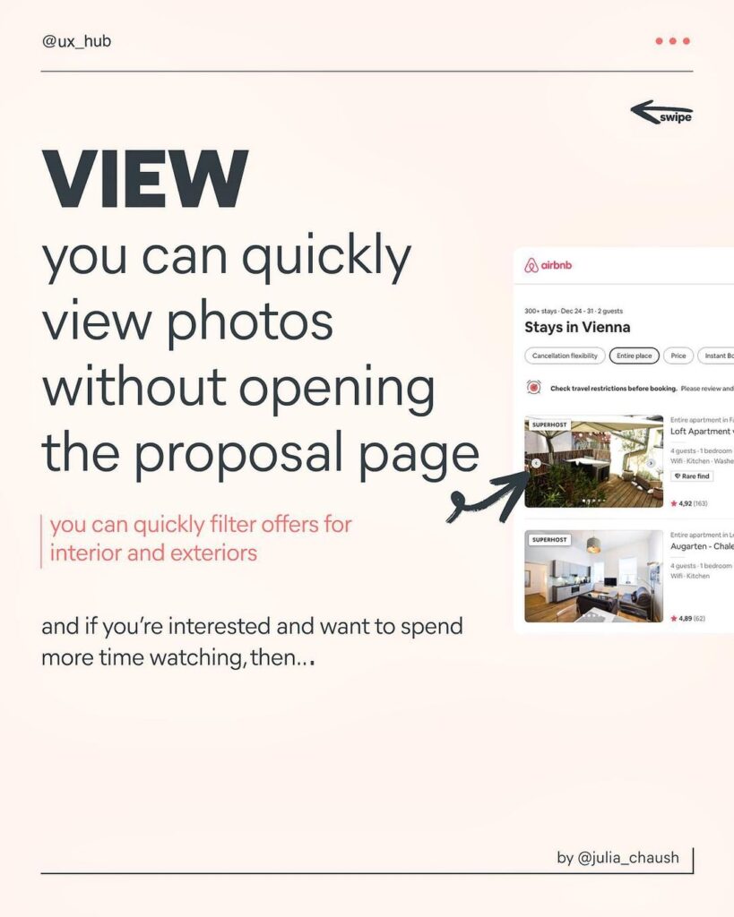
Again, following the K.I.S.S (Keep It Simple Stupid) rule, the way you view the listings is very simple. You can quickly view photos without opening the proposal page.
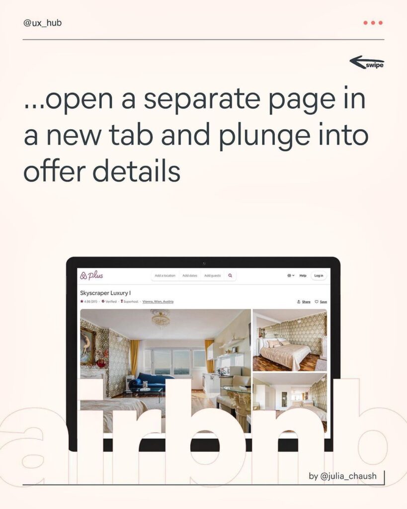
You can also quickly filter offers for the interior and exteriors. And if you’re interested and want to spend more time watching, then you can open a separate tab and plunge into offer details.




Thank You


Did you like it? Share it with your friends and let us know your thoughts in the comment section below.

