Earlier, we discussed the basic elements of design, which were line, shapes, space, texture, and color. Today, we’ll be having a look at the basic principles of design. These principles are important in guiding the use of these elements. We follow these principles to create an effective and attractive composition.
But first, how many principles are there? 7? 12? or maybe more? The actual answer is, we can’t actually say. Even if you search on Google, you’ll find articles ranging these principles from as low as 5 principles to as high as 24, or maybe even more. The thing is, unlike science, there is a lot of uncertainty in design. There is no straight formula, and many experts even disagree with what should and should not be a principle of design. We haven’t found our Mendeleev yet.
In this article, we’ll be having a look at the most basic principles of design which almost every designer will agree is a basic principle of design. Let’s have a look at them.
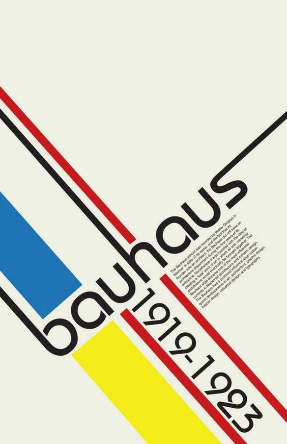
1. Balance
The first principle we’re going to talk about is the principle of balance. Balance refers to the way the parts of a composition are arranged. It can also be referred to as the “visual weight” as once side may feel heavier than the other.
There are 2 types of balance we’re going to look at:
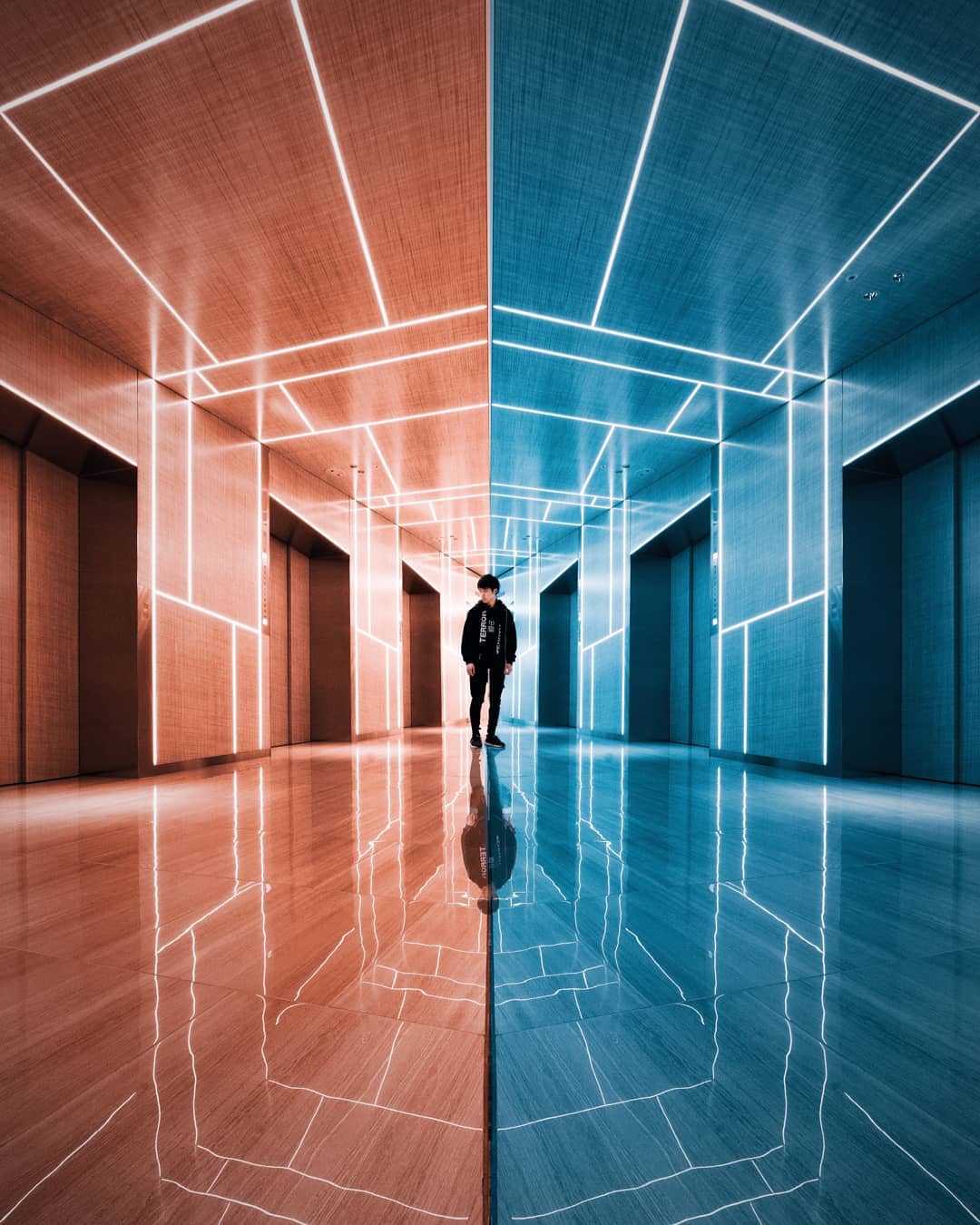
A. Symmetrical Balance
This is when everything is equally distributed and looks the same on both sides. If you fold the design vertically, both sides will overlap on each other, it’ll be a mirror image. And the same will be true horizontally if that’s the way you’re going with your symmetrical design.
B. Asymmetrical Balance
This is when things are uneven and one side seems visually heavier than the other. So you might have a few more elements on one side to make it feel a little heavier, or bring emphasis to one point. But, there’s a lot more empty space or white space used on the other side.

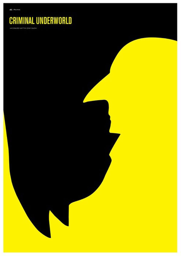
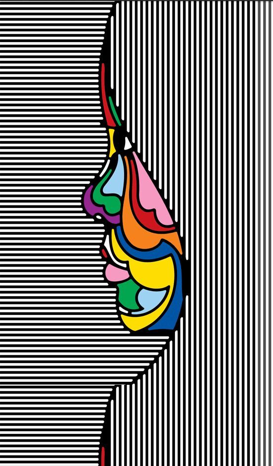
2. Contrast
Contrast shows the differences between the elements of design or subjects in a work of art. When you’re thinking about contrast, think of it like a compare and contrast chart. When you compare 2 things, you’re showing the similarities, whereas, when you’re contrasting 2 things, you’re showing the differences.
If you’re using the principle of contrast, you’re showing the differences between an element. for example, if you’re looking at a line or using lines as your element, you could show the contrast of a curve line with a jagged line. Or you can use an organic shape with a geometric shape.
You can even contrast your subject matter, showing something like good vs evil, or tall vs short. So it’s any way you use your subjects or elements to contrast or show a difference in your design.
3. Emphasis
Emphasis uses a focal point or a center of interest in the design.
It can be used as a single element of design, such as a single shape like a circle in the middle of blank space. But a lot of times it’s used in combination with other elements of design. For example, using lines to draw your eye to a single focal point, or using small shapes to draw your eye to a center of focus. Emphasis can also be used with other principles of design.
4. Movement
“Movement” shows action and it directs your eye throughout the work of art. And if used properly, it can be an effective tool for moving people throughout your design.
It can be used on its own as in it’s the only principle used in your design. But a lot of times it’s used in combination with other principles of design.
You can have “movement” from one value to another from contrast, you can have movement from balance showing an asymmetrical balance where it’s heavier on one side to a more empty area.
So movement can be used in a variety of ways, all of which are effective but it’s really up to you which one you think works best for your design.
5. Proportion
Proportion is the relationship between the size of objects within a design or work of art. In other words, it’s the scale of the objects, large and small.
Proportion helps communicate the relationship between subjects in your design. It can also show the level of importance. Things larger will be more important than those that are smaller. Things larger can also seem like it’s overwhelming where smaller things seem kind of insignificant.
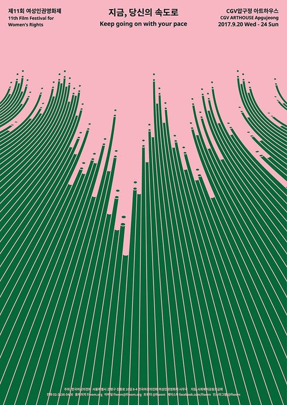
6. Rhythm
Rhythm is a type of movement that is seen in the repeating of shapes and colors or other elements in your work.
What separates rhythm from movement in terms of principles of design is movement can be one line or two lines that kind of push you to one point. With rhythm, its a repetition or a pattern of shapes, lines, colors or whatever element you’re looking at.
It can be seen as repeating shapes that vary back and forth with different proportions and sizes, it can be colors that go back and forth. It can even be the same shape but repeated over and over but transformed and rotated in different directions so it appears different but you have this rhythmic, almost repetition kind of feel to it. Think of it like music. It’s kind of a beat, a visual beat in your design.
Thank You
Thank you very much for your visit and I hope you found something to take away from the article. If so, please share this article with someone who can also benefit from it. Also, I would love to hear your design journey, so please, jump on to the comment section and let’s start a conversation 🙂