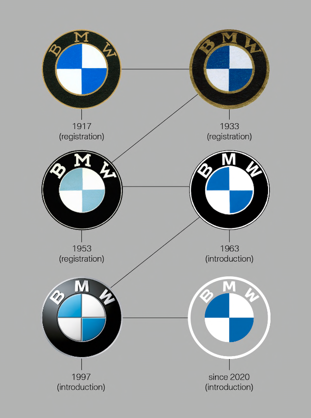
BMW is still teasing us for the long-awaited electric i4 Sedan. After so much wait, they have finally released some new concepts for the model. And along with the new concept release, they also released the new BMW logo. The iconic black ring is gone now and we can see a minimalistic approach in the new logo. The colors are flattened to give it a more minimal and simple look. Whereas, the circle and the blue and white colors remain.
Biggest Change
This has been the biggest change to the company’s logo since 1917 when BMW first registered its logo. The removal of the black ring can be considered as a very bold move.
We can see that BMW has taken a modern approach for its new logo but also considered its rich history.
Why the Change In BMW Logo?
Jens Thiemer, the head of BMW brand management and marketing department stated that “BMW is becoming a relationship brand”. The new logo is a step in that direction. It will attract new customers to rediscover the brand with its rich history and products.
Moreover, they also wanted the new logo to be more open, which could convey the message that it is more open and accessible. This logo also marks the start of an electric revolution in the company because of its style and the fact that it was released alongside the new concept of BMW Electric i4 Sedan.
The Meaning
The meaning of the logo still remains the same. According to BMW: “The first key to the meaning of the BMW logo are its colors: white and blue are the colors of the State of Bavaria in Germany, home of BMW. A 1929 BMW ad depicts the BMW emblem, complete with the four colored quadrants, in a spinning airplane propeller. The interpretation that the BMW logo represents a propeller has endured ever since.”
Whereas, the logo now is more open and depicts more openness and accessibility. It also marks the start of an electric revolution in BMW.
Logo Changes Over The Years


What are your thoughts on the new logo? Do you like it? What would you have changed if you were designing the new logo? Do let us know in the comment box below.

