Which brand do you think has the most expensive logos to date? Any guesses? I bet you’d be surprised to know it and the price that was paid if you didn’t know it earlier.
A logo is the first thing that your clients or customers will notice when exposed to your brand. And this will make the first impression of your brand.
You want to make the best first impression on your clients and customers to have a better chance at securing a deal or simply to build trust with them.
In order to achieve that, big businesses spend millions and even billions on branding and advertising. And today, we’ll be looking at 10 most expensive logos and rebrands till today.
So, without further ado, let’s check out the list.
1. Symantec Brand & Acquistion – $1,280,000,000


Mind boggling right? But is this skyscraper cost just for the logo? No.
Verisign was in the huge list of Symantec’s acquisitions. And when they bought Verisign, a whole lot came with it, including this tick logo. So, the price is not just for the logo but for the acquisition of Verisign.
It might look like a very basic tick logo but it represents much more than that. This represents trust and also tick of SSL security certificate, which is also a symbol of trust and security.
Now whether you think it as a logo and branding price, or not is totally up to you.
2. British Petroleum Logo & Marketing – $210,000,000


British Petroleum’s logo design features the shades of yellow and green. This represents the company’s commitment to building a better planet.
The price also surged because of the devastating oil spill in the Gulf of Mexico. Yes, the Deepwater Horizon oil spill.
3. Accenture Logo Design — $100,000,000


Wow!! $100,000,000 for this simple logo design? It might seem like a waste of money for Accenture, but it’s not about the complexity of the logo that determines the value of the logo.
There are a lot of factors involved. Just look at this simple yet powerful branding by Landor Associates. It is pure text but the touch of the forward mark turns it into a powerful logo.
But yes, many claimed that this price is too much for a logo that does not even convey enough meaning. Now, Accenture is a well-known company with an instantly recognizable logo.
4. Posten Norge Rebrand – $55,000,000


Posten Norge or The Norwegian Post is the name of the Norwegian postal service. And “Posten” literally means “Post” in Nordic languages.
The price seemed to be a little too much for a postal service right? But note that Posten Norge is responsible to distribute and deliver letters across Norway.
In 2008, it went through new marketing strategy and did a whole rebrand.
5. Australia & New Zealand Banking Group (ANZ) Logo – $15,000,000


This huge amount of $15,000,000 actually is not just for the logo but for a marketing campaign which started in 2010 and ended in 2012.
The logo comprises of simple letters ANZ with a line in between to create a sense of movement.
Considering this is the cost of a marketing campaign, the largest bank of New Zealand and third largest bank in Australia won’t mind spending this much.
6. BBC Logo Redesign – $1,800,000


Yes, the British Broadcasting Corporation (BBC) spent more than a million dollars for its logo redesign.
The logo simply letters BBC in black square boxes. The squares of the BBC logo are unique and convey the company’s rapid progress in the modern world. The shape of the BBC logo defines the corporation’s objectives and limitations. Color of the BBC Logo: Black is a color that represents strength, dignity, and power.
7: Pepsi logo – $1,000,000


This shouldn’t be coming as a shock considering the popularity of the brand, what the logo will represent, and how a logo can be an impact on pop culture.
This was a slight alteration to the early Pepsi logo with the same set of colors but tilted at an angle with a flat design.
Many considers this redesign was a challenge to the iconic Coca-Cola.
8. London 2012 Olympics Logo – $625,000


Ahhh, the biggest sporting event in the world. With the best athletes coming to compete and the huge volume of eyes on it, you know the money coming in and the spending will be huge.
Many praised the logo but some criticized it saying that it was poorly crafted and not enough meaning was there behind the logo.
Check out the review of the London 2012 Olympics Logo by experts like Paula Scher here, Chip Kidd, Rick Valicenti, Lisa Simpson, Carl Rush and Andrew Bogucki here.
9. City of Melbourne Logo Design – $625,000


Yes, a city in the list of most expensive logos? Logo for the city of Melbourne cost $625,000. And there was no occasion for it like an olympics.
This logo similar to the Accenture logo was designer by Landor Associates with letter M and sharp lines and multiple shades of blue and green inside it.
10. Belfast Logo Design – $280,000
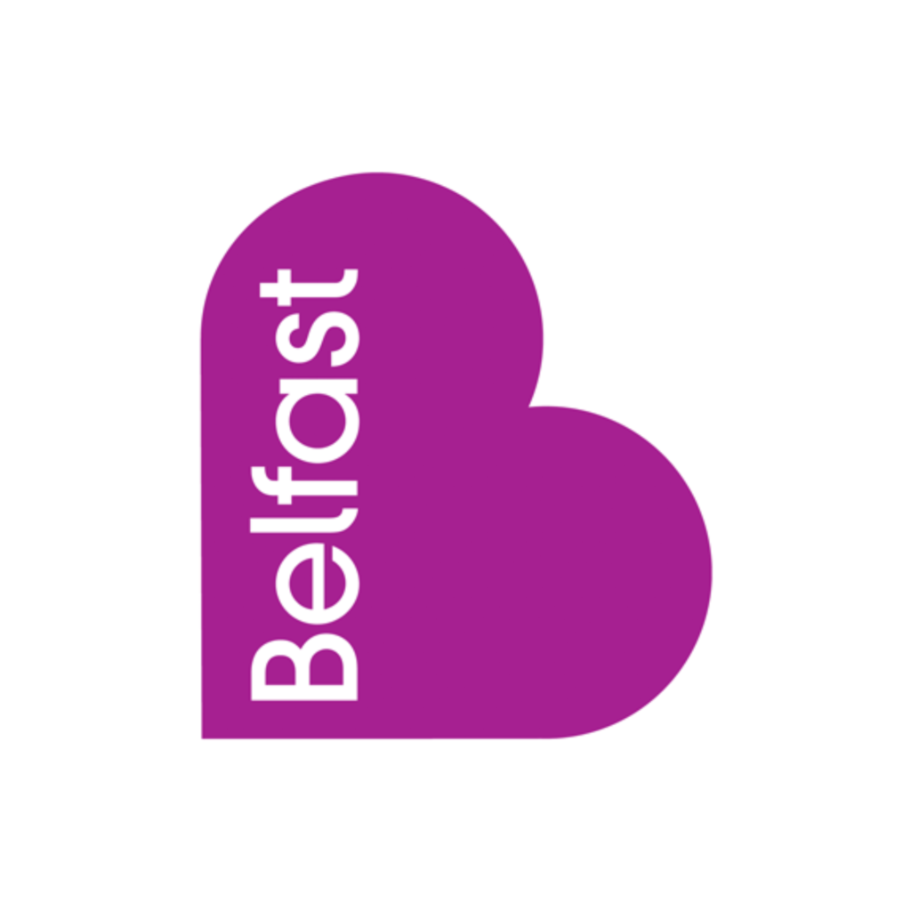


Yes, another city on the list. Now the capital of Northern Ireland, Belfast’s logo cost around $280,000.
One thing that is interesting about Belfast’s logo design is that it is available many colors like maroon, fuchsia, blue, lime, etc.
It can be seen as a heart or a stylized letter “B” with the name of the city “Belfast” written inside the logo.
Thank You
Did you enjoy the article and were you blown away by checking prices of the most expensive logos or brands? Please share with a friend who might find it interesting as well. Thanks for reading 🙂

