
We heard a few weeks back that Cadbury might be changing its logo pretty soon. And, today, finally, they unveiled their first major design rebrand in half a century.
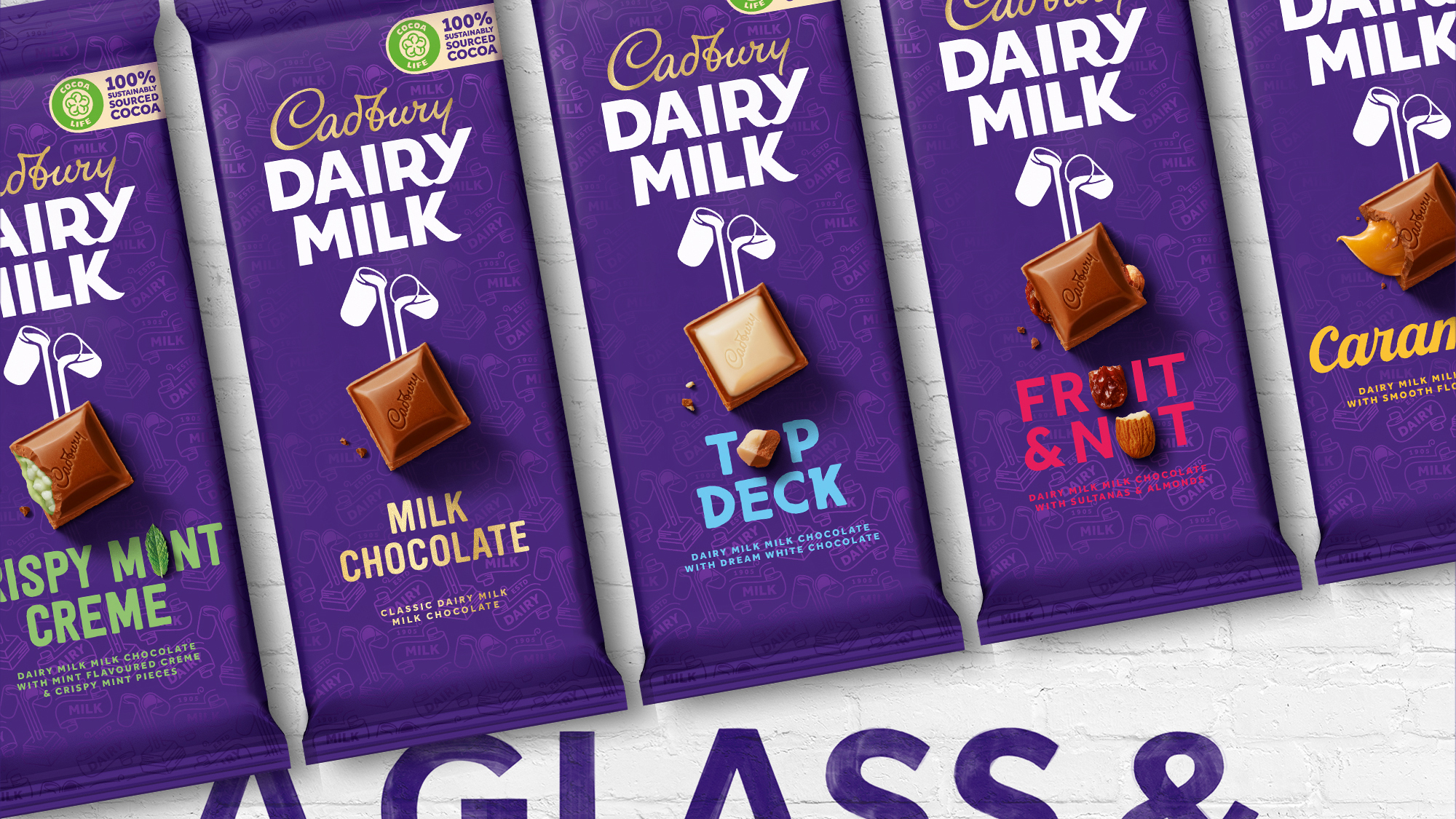
Bulletproof is the Design Agency behind this rebrand. The new logo, as you can see has preserved the original feel of the logo, i.e., the emphasis on the handwritten nature of the logo and a cursive quality to it. The biggest change we can see in the logo is that it has gotten a little thinner and, the ‘b’ in Cadbury is new. Cadbury has one of the most recognizable and iconic logos, so I guess, the designers and maybe the company itself didn’t want to make drastic changes to it.

About the logo and rebranding, Cadbury issued a statement saying:
The Cadbury logo redesign is part of a much wider brand refresh which began over a year ago and touches all Cadbury visual assets. The cost of this work to the UK market was nowhere near the £1million figure that has recently been suggested and reported in the press”
As you can expect, like most big rebrands, the reaction from the internet users was mixed. This happens almost every time when a big company goes under rebranding its brand or even a change in its logo. Just take BMW as an example. But sooner or later, they do make peace with it.
What do you think of the new Cadbury logo and design rebrand? Also, share with your friends and ask their opinion on it.