

Ever happened to you that you see a design and you’re too much overwhelmed with what’s going on? The design is all over the place and you just sigh and feel bad seeing the missed opportunity? Just a bit of tweak could enhance and multiply the effect of this design? It happens more often than you think, mostly with beginners. Yes, adding a lot of cool things in a design might make it look cool to you but if you look from the user’s perspective you’ll find that it can be a bit overwhelming and a bit too much. Today we’ll be learning how to make your design breathe.
These are some simple tips that you can even apply to your already existing designs. Even though these are simple, they are extremely effective and you’ll start to notice their effect right away. The post is inspired by Ismail’s wonderful Instagram post. Do check his page for similar content. Let’s check out these tips.
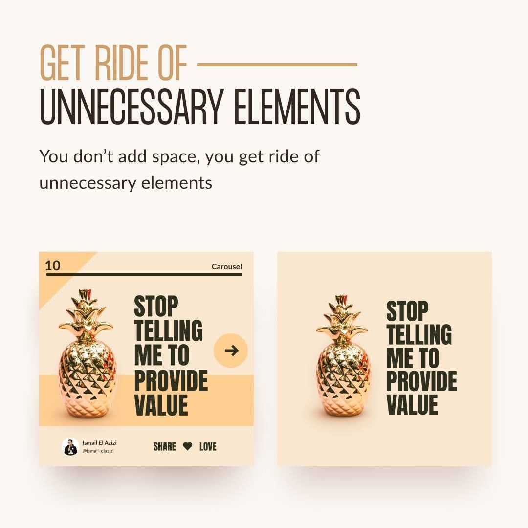
Get Rid Of Unnecessary Elements
Yes, get rid of unnecessary elements. You don’t add space, you get rid of unnecessary elements. When designing, always question yourself, do you really need this element? Is it serving the purpose or is it just for aesthetics? Be clear of what you’re targeting to achieve.
Add additional elements only when you’re fully aware and you can reason it to yourself why you’re adding it. If it serves no purpose, get rid of it. Again, you don’t add space, you get rid of unnecessary elements. Major tip to make your design breathe.
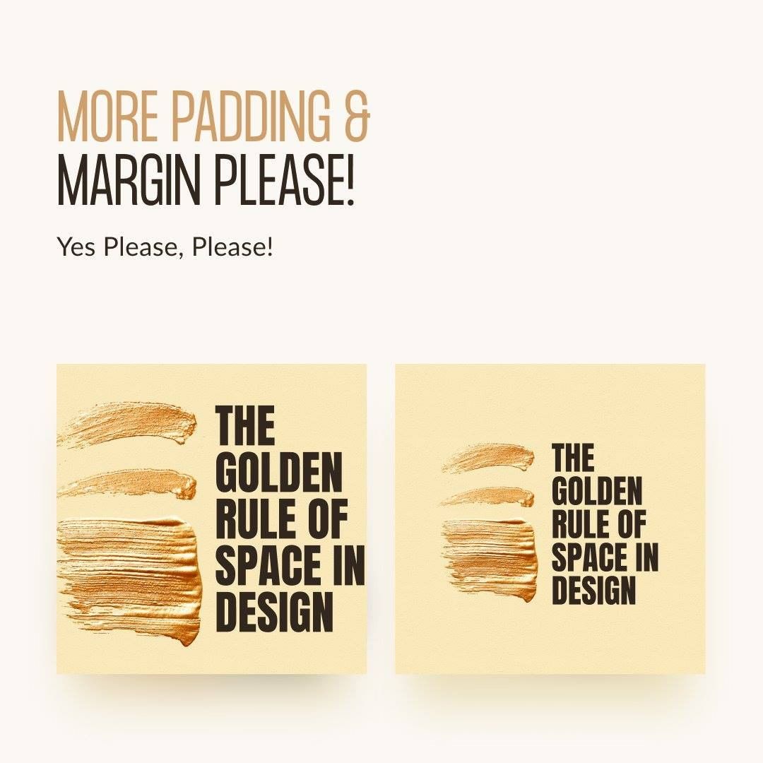
More Padding And Margin Please!
Check out the example below to understand. Which design seems more elegant? The left one might do the job and some might prefer it over the right one, but you can’t disagree that it is a bit too much and there is very little space to breathe. This might give a bold message but not a good idea in general.
Try adding padding and margin to your design and you’ll notice the difference. Most of the time, it’ll make your design much more pleasing to look at.
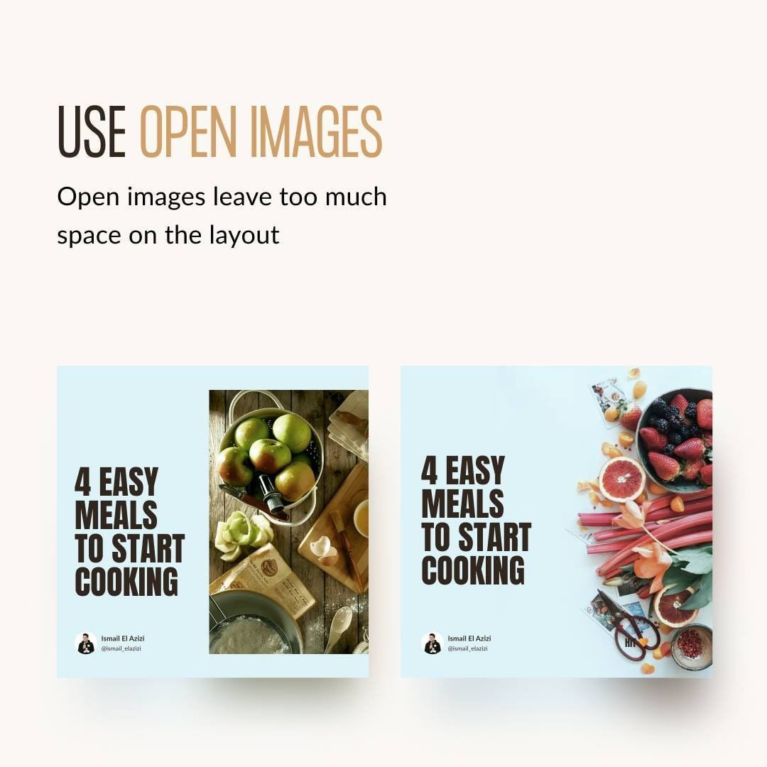
Use Open Images
Have a look at the image below. The difference is quite noticeable, right? Open images leave too much space on the layout to breathe. Moreover, they also immerse the user and obviously, make it a lot cooler. You don’t want to constrain your design in boxes, right? Well, mostly I guess as some might intend to do that, but other than that, using open images has nothing but positive impact on your design which is not just the breathing space.
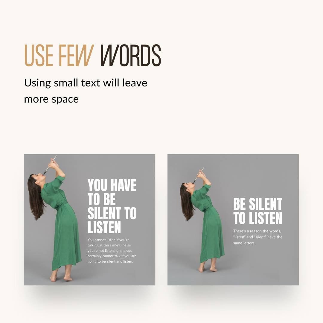
Use Few Words
Want more space? Try using fewer words. And, if a few words can convey the message you want to convey, why use more? Try to use fewer words to convey your message and it’ll give you extra space to work with. Using space in your design is crucial and using few words can help you get that.
Add Space Between Elements
You don’t want to make your design cramped right? Make sure to give proper space between each element. Otherwise, it can turn into one big mess. Adding space between elements is also pleasing to look at, have a look at the example below.

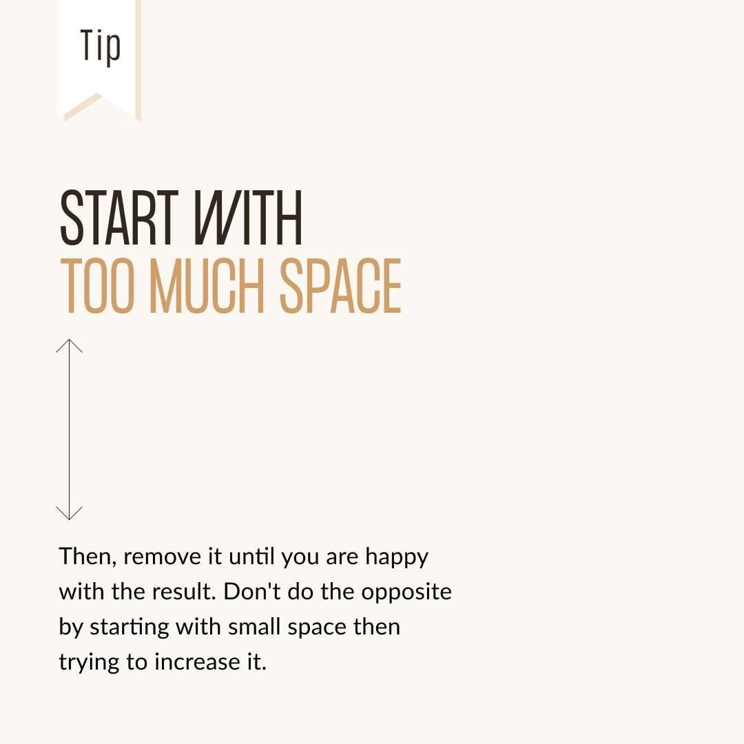
Start With Too Much Space
Yes, that’s right. Instead of making space after designing, do the opposite. Start with too much space and then start to remove it until you’re happy with the result. This will be faster and much easier to do. Whitespace is good after all. Try yourself!
Just Like You, Your Design Need Space To Breathe
Your design needs white space to breathe and now you know how you can get that. Let it breathe and you’ll feel your design living and blossoming.


Let It Breathe My Friends

Did you enjoy the post and found it useful? If so, please share it with your friend who might like it as well.
1 Response
[…] design I see every day. Your design needs to breathe… I recommend checking out this guide on how to make your design breathe. It’ll surely help you out in […]