

Do you think you make mistakes while designing? Yes, you do, as a matter of fact, everyone makes mistakes. There are many mistakes that graphic designers commonly make. But, it is important to be aware of these mistakes and fix them when possible.
Ever looked at a design and just thought if you could make something like this. Happens with everyone when we are looking at some inspiring work. But, let me tell you, you can design that well too. If you’re constantly learning, and you got the required skills, then only thing that is stopping you to achieve that level of perfection is yourself and some common mistakes we’ll having a look at today.
These are some very common mistakes that graphic designers make which can easily be avoided. Just be aware of them and check your design when done if you have any of these mistakes. If you do, try to rectify them the best you can.
1. Using Too Many Fonts
Experimenting with new fonts is fun, I know. But when you use all your favorite fonts within one graphic, flyer, web page, or branding, it gets confusing and hard to read and relate.
Maybe it looks cool at the moment to you, but it is not good for the user experience. They’ll be thrown back by it which is the last thing that you’ll want.
Solution:
Sticking to 2-3 fonts for your whole branding, or any other graphic project is always a good idea, unless you’re intending to a particular feeling or a message you want to deliver.
Choosing 2-3 fonts for your project will not only just improve the quality of your graphics, but it’ll also make your work more cohesive and well-knit.

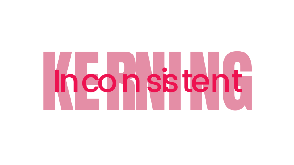
2. Inconsistent Kerning
Do you ever slack while checking the kerning in your graphics? I used to, but not anymore. It is very important to have proper kerning between your letters and words.
One might think it doesn’t make a difference, but it surely does. I can’t tell how many times I felt uneasy after seeing bad kerning in a graphic.
Solution:
Be aware of the space that you give in between the letters and words especially if you’re managing one letter at a time in your design.
Give it some extra time, a little time spent here would make a big and noticeable difference in your final design.
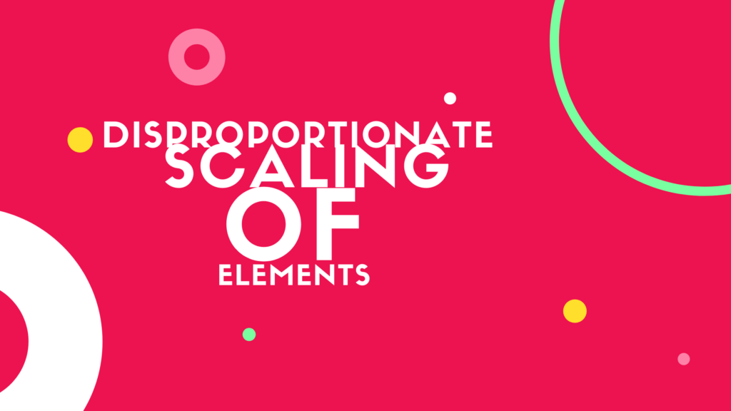
3. Disproportionate Scaling Of Elements
If you don’t intend to stretch an image, don’t stretch it, as simple as that. Stretched elements like words, images, shapes don’t look professional at all.
Like other mistakes, this one is quite noticeable and even a non-designer can point it out.
Solution:
Don’t stretch or shrink your images for the sake of fitting it in. Instead, adjust and rearrange the elements around until everything fits as you want them to.
If you do need to scale something, always do it proportionally. Use the shift key, which is common in most software (except Photoshop) to scale proportionally.
4. No Breathing Space
Using too many elements that are not required in a design leaving no breathing space is a very common mistake in design I see every day. Your design needs to breathe… I recommend checking out this guide on how to make your design breathe. It’ll surely help you out in that.
Solution:
There’s a lot you can do to add breathing space to your design. Like, using open images, adding padding and margins, using less words, and design elements. The process I would recommend you to follow is to start with too much space and then fill it up just till you find the sweet spot and you get the intended output.
Check out how to make your design breathe for more on this topic.

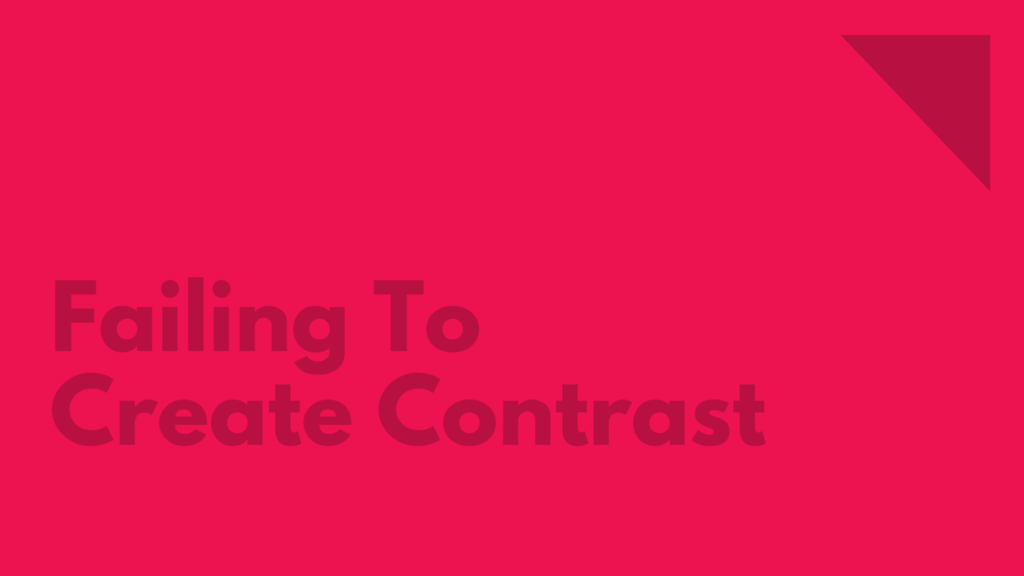
5. Failing To Create Contrast
Contrast is one of the most important design principle. Contrast shows the differences between the elements of design or subjects in a work of art. And sadly, it is one of the most common mistakes graphic designers make.
Using contrast correctly can enhance your design and make it much more effective.
Solution:
Color is a very effective way to establish contrast in your work but it’s not the only way to do so. Using organic shape with a geometric shape, or curved lines with straight lines are some of the ways you can also create contrast.
Here is a good guide by canva on how you can add contrast to your design.
6. Using Pixelated Or Raster Images
You know what I’m going to talk about here right? DON’T USE RASTER IMAGES. Avoid them as much as you can in your design. Pixelated images never looks good.
Solution:
When designing, try to use vector elements. And when exporting them, export at a much higher resolution than you need. You can always scale them down if you want to and it won’t harm the quality.
7. Using Inconsistent Color Palette
We all love colors, right? But we don’t have to use them all. Using an inconsistent color palette not only just confuses the user, but also makes your design and brand hard to remember.
When designing, you want your customer or user to remember your brand or design. And having a consistent set of colors throughout the branding is a good way to make your brand recognizable.
Solution:
Learn the art of color coordination. What are the effects each color have on the user and use the the ones which fits your purpose.
Moreover, set a certain number of colors to bring consistency to your overall design. Make your own color palette or take inspiration from other sources. And try to stick to the colors that you decided.

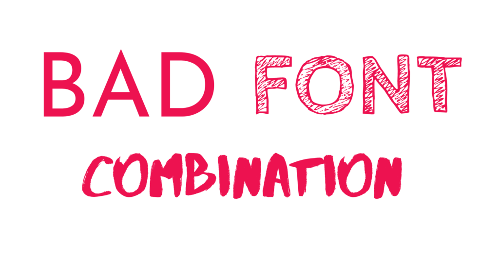
8. Bad Font Combination
Using too many fonts is a mistake we talked about, but the ones we chose also has to good fonts and their combination should also make sense. Not all fonts can go together.
A bad font combination can make your design look unprofessional and unorganized.
Solution:
Before putting a concrete on your chosen font combination, test them out if you can. Is it really what you want? And are the fonts syncing correctly?
If you’re not sure, try taking inspiration from other sources like FontPair. Also, I highly recommend you to check out inkbot design’s guide on font combination.
9. No Proper Alignment
Alignment is very important in any design project that you do. Lack of it can result in an unorganized end result which you’d surely don’t want. Because sometimes we go with instincts and don’t pay enough attention at alignment, it makes it one very common mistakes graphic designers make.
It is a way to gain symmetry in your design and make your final design look more organized.
Solution:
Be aware of how you’re placing each design element. If you intend to gain symmetry in your design, give some time to the alignment of the elements. Don’t place them randomly.
Try to take the help of the software you’re using to align the elements. Or if you’re using paper, take the help of a ruler. Instinct might not always be right.

Did you find the article helpful? If so, share with your friends who might find it helpful as well. Thanks for reading and keep designing.